- Community >
- Blog Central >
- Blog by dragonkaty >
- A picture says a thousand words
| Mar 6 |
A picture says a thousand words
|
Nothing can highlight your product like a picture, and a truly professional picture not only shows off your items, it can help move them off your shelves quickly. High quality photographs are an investment in your creations; they say that the creator believes in their products and can often sell the products themselves.
Getting your products photographed professionally is a wonderful investment, but not always in the budget of the small craft business owners. There are ways that you can work around this – contact a local college or high school and see if students in the photography classes are looking to build their portfolio. They will relish the opportunity to have their photographs published (and to get the photo credit), and the small crafter can benefit from low cost (or even free), high quality photographs.
If you are creating your product photos yourself, here are some quick tips that will help you produce better results:
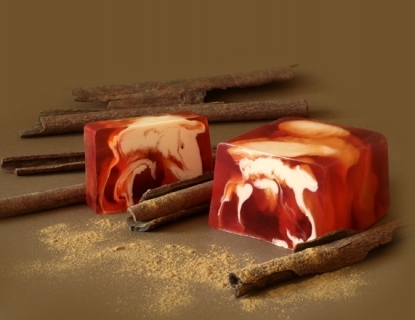
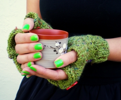
Rule of Thirds: Imagine that your image is divided into nine equal squares, basically a tic-tac-toe board with the lines equally spaced. The human eye is naturally drawn to the areas where the lines cross – not the center of the frame. You will get maximum impact from images where your subject is along one of those intersection points.
Examples:
 |
 |
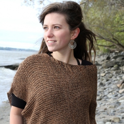
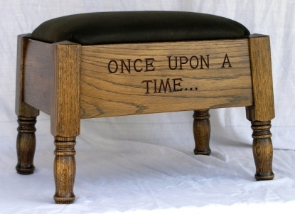
Background and foreground: A photograph is a ‘flattened” 2 dimensional representation of a 3 dimensional item. Balance both the background (anything behind your subject) and foreground (anything in front) to ensure that your photo gives your product some dimension. Remember though, sometimes a plain, crisp, white background can be just as effective.
Examples:
 |
 |
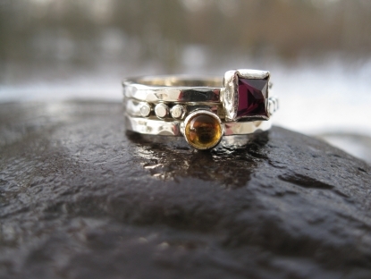
Focus: Do you want your subject be in focus or fuzzy? How about having your product in focus but the background fuzzy? Focus can really make or break your photo so test your scenes to ensure effective results. In general, you want the product and foreground in focus but the background blurry. Experienced photographers can tinker with the aperture (F-Spot) opening to get the effect they desire.
Examples:
 |
 |
Lighting: always be aware of your lighting! Not only will it affect the brightness or darkness of the photo, it can really affect the number of shadows. Remember, shadows give depth to the photo, making it feel 3 dimensionsl. Avoid harsh light behind your product, watch for shadows and for whites that glare in the light.
Examples:
 |
 |
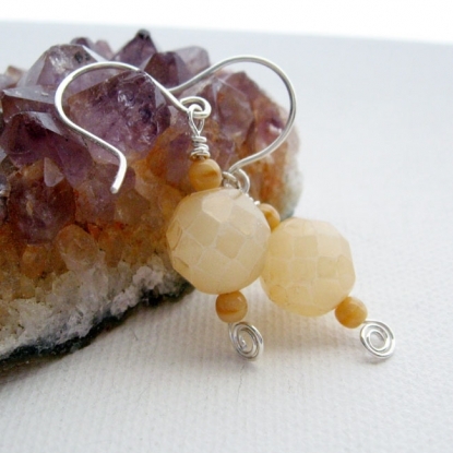
Color: Romantic poet, Leigh Hunt, said that “Colors are the smiles of nature.” Your product has a color, even if it is black and white. Pay attention to how its color interacts with your background and foreground. If the background is the same color as the product it can make seeing the product difficult, whereas a clashing color can upset the viewer’s eye. Make sure they compliment each other without overwhelming.
Examples:
 |
 |
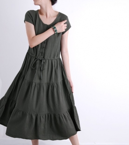
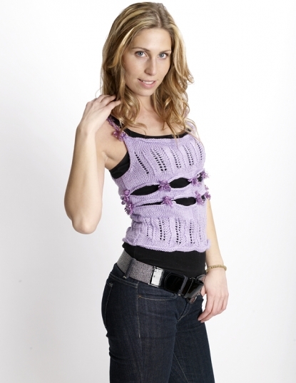
Models: Nothing can help sell your products more than humanizing them. This is particularly true for selling clothing products. Imagine how flat a photo of a dress can be if there isn’t someone wearing it to give it depth and feeling. Seeing a product on a model helps the viewers’ mind see the item in context.
Examples:
 |
 |
 |
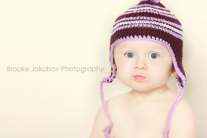
And remember, we all like ‘cute’ photographs so if your product is for a baby or child, and you or your friends’ have an adorable kidlet… make use of them.
 |
 |
 |
- Category:
- Art & Photography
- Tags:
- photography
- tips
- models
- professional
- professional photo prop
1 Comments
Nov 7, 2011 | LisaGold
I'd love to buy that soap. Help!


