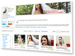
As a shopper, I know that I certainly pay a lot of attention to what an online store looks like, and silly as it is, because essentially its a virtual store, I know that the banner, logo and brand identity makes all the difference in persuading me to buy into that particular store.
We've talked about the shopfront as a whole but here I'd like to talk about the banners specifically - they are such a simple thing to correct and can change the entire look of your shopfront, it's really upsetting when good products are let down or passed by because of a shoddy banner.
A good banner or logo also translates to branding potential. Whether or not your store is your livelihood or whether it just a hobby, it's important to look at the bigger picture in terms of your brand. There needs to be consistency in your imagery, can your banner or avatar translate easily into a logo alongside a creator interview of yourself? Will it sit nicely on a flyer promoting crafts in your neighbourhood? What makes your brand stand out immediately from the others?
To me the following things are important when I browse online venues:
* Any photography/imagery included in the banner should be of a good resolution and clear. There is nothing worse that clicking onto a shop site and seeing a halfhearted banner with fuzzy or stretched product imagery.
* A logo or motif immediately assures me of the authenticity of the brand. This can be as simple as creating a memorable logo like
this or if you don't have the know-how, using eye-catching text like
this.
* In my opinion, less is more, the more minimal you keep your banner the more professional it looks and the more buyers focus on your beautiful products.
I spent some time looking at banners on iCraftGifts.com and found lots of great ones (and lots of not so great ones!). I decided to take some stores in each of our selling categories and explain what attracted me to them. Hopefully this will help inspire sellers here within their own categories.
ARTWORK
Dekolina A bright and simple banner that showcases the sellers talents...I loved the simple colours of this one and branding potential in the logo, the text and the illustration. Any of these three elements could be used for branding. This style of banner can be applicable to any seller that puts importance on packaging and labeling when sending out products - why not use an image of your own label in your banner? This helps create awareness of your brand.
JEWELLERY
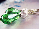
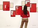
Gionella Jewelry A pretty and high end looking banner. I love use same colour of font and abstract pattern which somehow adds an exclusive fashion-y feel to it. All the elements tie in really well.
CRAFTS
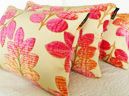
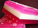
The Pom PomThis instantly caught my attention - its bright and cheery but simple. The image is shot well and the font and its colours are modern and bold, inspiring confidence in the sellers creative eye.The banner doesn't focus on any one type of product but the materials used as a whole which I found preferable to banners featuring say one scarf or bag from the collection. Why not work on creating a simple image of the materials you work with? A close up of balls of wool, spools of thread, an abundance of quirky buttons...
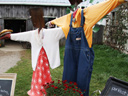
FURNITURE
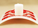
Mike ReillyThis is such a sweet banner and although it might not work for many categories, it fits in really well with the 'home town' nature of this brand. The image is shot really well and I love the light coming in from the windows giving it a homely glow. This might work really well for other furniture or homeware items, with the products shot against the background of a vintage workbench or striking workshop wall.
CLOTHING/ACCESSORIES
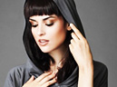
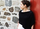
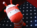
The Finicky SticherThis banner is simple and neat and cheerful. The knitted products are shot well and look very professional (somehow everything looks instantly marketable with an iPod inside!). The font is cute yet modern - a very appealing looking banner.
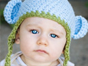
KnittlesI think even if the rest of the products were not shot on models, this store would still attract me with its professional looking banner. The font and colours used gives the store an urban feel. The naturally lit style of photography used in the banner means that it could be replicated quite easily without high end photography tools. A quick snap of your model in a well lit window (be it a photogenic friend/family member/baby and product, then up the contrast slightly in a standard design application on your computer - and voila - everyone/everything looks funky!
What does everyone else think? These are just my opinions of what attracts me as a shopper. I think it's important we assess what our shops look like, it affects how buyers see your shop, your fellow creator's shops and in turn iCraftGifts.com as a whole.
Did you like the ones I picked or were they too plain? Do you like to see something more colourful and elaborate when shopping online? Do link to your favourite stores.
Look forward to hearing your thoughts.
Rohini
x
 Author