iCraft Admin

Administrator
Posts: 1715
|
|
« on: July 17, 2011, 12:54:09 am » |
|
Hello iCrafters, I know we've been talking about the new site design for a while now, so I thought we probably should give you a preview of what's coming soon. Below is a sample Store page. Yes, we are going to rename our Creator Exhibits to Stores or Shops, as those are universally understood terms. 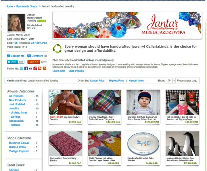 Additional changes are: Additional changes are:- Wider page layout
- Page optimized for SEO, mobile view & faster loading
- Same size product photos (we are working on the photo editor right now too that will allow you to center, crop and adjust quality of your photos)
- Your product categories, including Shop Collections will be listed on the side
- Additional pages to display longer Bios, Store Policies etc. That will allow us to reduce the amount of copy we have on some pages right now. The goal here is to bring products above the fold.
- Basic Social Media icons for people to follow and subscribe to your updates.
We'd love to hear your first reactions to these changes. Thanks!  |
|
|
|
|
Fairy Cardmaker

Posts: 1115
|
|
« Reply #1 on: July 17, 2011, 12:27:00 pm » |
|
These are all EXCELLENT changes. My favourites: - Same size product photos (we are working on the photo editor right now too that will allow you to center, crop and adjust quality of your photos)
- Your product categories, including Shop Collections will be listed on the side
- Additional pages to display longer Bios, Store Policies etc. That will allow us to reduce the amount of copy we have on some pages right now. The goal here is to bring products above the fold. Love that there are subcategories in those collections. Awesome. My suggestion: remove the dash beside the quantity of things in a category. Maybe it's just my accountant's brain but I see "negative" 25 units. Just looks strange to me. My question: Where are the links to move around the iCraft site as a whole? The banner I guess it's called. (Are they outside of this sreenshot, still above the shop?) |
|
|
|
|
iCraft Admin
Administrator
Posts: 1715
|
|
« Reply #2 on: July 17, 2011, 02:41:19 pm » |
|
Thanks for the feedback, Fairy Cardmaker!  I actually had the same concern about dashes beside the quantity. Good to know others have a similar reaction. Yes, top nav bar will be at the top of every page. It's being redesigned too, as well as the footer. As I said, this is just a preview. There is a lot more coming. So stay tuned!  |
|
|
|
|
GalleriaLinda

Administrator
Posts: 442
|
|
« Reply #3 on: July 17, 2011, 04:52:22 pm » |
|
Certainly some very nice features coming our way!! Good job and can't wait! I do have some comments in design - these are just my preference but throwing them out there: - I will miss my large banner that equals the height of the photo/avatar and looks less cluttered. But I realize that all those features on the side are needed. You could scoot down everything on that sidebar to accommodate.
- I am not sure that I like the product thumbs with borders and shadows - looks confining. I know other venues do that. I love what we have because it all seems to flow into one space. Maybe it is because most of my backgrounds are white-ish.
- The links show as bright blue and I think distracts and clutters. Maybe put them in a dark gray/light gray?
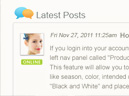
- The little green swirly thing by the shop's tag line (you used mine! LOL!) - I think that color detracts too and really like what we have - the little sprig of leaves or some other less techie image.
I realize that a lot of tweaking is going on and I trust your judgement based upon the needs. All-in-all - great improvements in features and functions! |
|
|
|
|
Fairy Cardmaker
Posts: 1115
|
|
« Reply #4 on: July 17, 2011, 09:39:13 pm » |
|
The little green swirly thing by the shop's tag line (you used mine! LOL!) - I think that color detracts too and really like what we have - the little sprig of leaves or some other less techie image. I like our little sprig too. The leaves in the new one kinda look like a newage recycling symbol. |
|
|
|
|
Northern Girl Jewelry

Posts: 199
|
|
« Reply #5 on: July 24, 2011, 08:45:00 am » |
|
Very happy about some of the new layout, especially about having separate bio and shop policies pages which will bring the products up above the fold and will reduce some repetition on product pages.
Also very happy that navigation within the shop will be moving to the left, which will make it easier and more obvious for buyers to find.
However, I really liked having 5 products per line as we have currently - I think it makes icraft different than many other sites (like etsy and artfire) which have 4, but I understand that the fifth row will be given up to shop navigation, which I do like.
I'm very glad however that the product photo sizes will remain the same. I really like that icraft has always given us large thumbnails.
I see that our products will now be on multiple pages instead of just one page as is currently. That's probably a good thing for very full shops, but I liked that someone could see all products in a shop just by scrolling instead of by clicking through pages.
Overall, the new look is nice and clean and will likely be easier to navigate. But I feel a bit sad about it because I think that it will result in our shops here looking a lot like the shops on the other sites. And one thing that has been really nice about icraft is that it looked a bit different and has always been an aesthetically pleasing site.
|
|
|
|
|
iCraft Admin
Administrator
Posts: 1715
|
|
« Reply #6 on: August 04, 2011, 02:46:49 am » |
|
Hi Northern Girl Jewelry, We plan to set the default number of product thumbnails per page to 20, which is 5 rows of 4 thumbnails. That's actually a lot, considering how busy that page is. This will speed up page loading. However, if the user will choose a higher number, like "100 per page", system will remember that setting and will always show the user preferred number of product thumbnails on every page where they've changed it - on store pages, replacement results pages etc. I hope we won't look like every other marketplace out there. That would be scary... thinking of one particular site that ends with ...fire ha ha. (I probably shouldn't have said that  ). That's definitely not what we are trying to achieve. I guess there are certain elements that you will find on our site, as well as on others, but the decision for those changes are usually driven by the need to solve a design problem, is a result of the usability testing or analyses of web stats... and not because someone else has done it. We are always looking for ways to improve, so even after we roll out the new design, we'll be doing more testing and validation of the design decisions. We believe in design. But we also believe in usability. So we hope the new site will still be aesthetically pleasing and usable at the same time. |
|
|
|
|
iCraft Admin
Administrator
Posts: 1715
|
|
« Reply #7 on: August 04, 2011, 03:20:13 am » |
|
Hi Linda, - Banners were shrunk because they took too much space above the fold and on some Stores products were pushed down below the fold. We wanted to bring them up.
- We had many discussions about product thumbnails. Your images are the best and will look great with or without a border. That's not the case with other images. They are all different in terms of sizes, shapes and quality. Forcing a certain size gave us more control over positioning elements on the page (more predictable) and borders added some continuity in how products are displayed throughout the site. Our early user testing showed that people liked (or at least, didn't mind borders).
- You'd be happy to know that the little green swirly thing is gone! The leaves are back
|
|
|
|
|
Fairy Cardmaker
Posts: 1115
|
|
« Reply #8 on: August 04, 2011, 11:09:31 pm » |
|
You'd be happy to know that the little green swirly thing is gone! The leaves are back Lol - YAY! |
|
|
|
|
Beajoux

Posts: 78
|
|
« Reply #9 on: August 11, 2011, 08:17:14 pm » |
|
Hello,
A little late chiming in, but I just thought I'd mention this: the row of 5 nicely accommodates the 5 free listings that sellers have, if they don't subscribe to a plan. Do you plan on changing that number to 4? Or to 8? I wouldn't like to see a row of 4 and then one lone picture underneath.
Ainsley
|
|
|
|
|
iCraft Admin
Administrator
Posts: 1715
|
|
« Reply #10 on: August 17, 2011, 12:18:19 am » |
|
Hi Ainsley,
We plan to remove the free option completely. We'll probably do that for new members only and allow current members to keep 4 free listings for a year or so. The problem with the free listings is that people don't take them seriously. Most of those who have free subscriptions right now, don't visit their stores for 6 months or longer.
So we've been wondering what we should do about those free listings for a while now.
We are also thinking of offering 1 month trial period for those who'd like to try out our system, but after that we'd ask them to choose one of our subscriptions.
|
|
|
|
|
Fairy Cardmaker
Posts: 1115
|
|
« Reply #11 on: August 17, 2011, 06:52:26 pm » |
|
Listings that are over your subscription package are $0.20 each. I'd say take away the free option and leave this as a "pay as you go" option. Once a shop reaches 25 items, they will pay $5.00 which is the price of the 50-listing store.
So, if someone wants to do a trial, they might want to list 10 items. Another person might try 5. Another might try 8 (to make two even rows). Those people will pay something less than the minimum package of 50 listings. They can continue on like that forever. If, instead, they find things take off and want to list more stuff, then maybe they will upgrade.
This system works beautifully for custom shops. Those shops may not need more than 5 listings to show a "portfolio" of their work. Currently, there could be a huge volume of custom work driven through iCraft that iCraft gets nothing for. At 5 listings, you could be getting $1.00 month. Peanuts to a custom artist, IMO. Even $2.00 a month for 10 listings for a custom artist is peanuts.
Now, it would be costly for a shop that needs 100 items of variety of finished goods to continue operating that way, but $6.00 to list 10 items for 3 months to test the waters? A worthwhile investment in my mind.
I vote for a pay-as-you-go system for small sellers.
|
|
|
|
« Last Edit: August 17, 2011, 06:54:25 pm by Fairy Cardmaker »
|
|
|
|
|
Beajoux
Posts: 78
|
|
« Reply #12 on: August 17, 2011, 10:40:09 pm » |
|
Hmm. I've had my shop for over 3 years. Currently, I'm averaging one sale/year.  I've had the subscription plans so I could list multiple items. I use Twitter and Facebook to drive traffic. I have over 5,000 page views. When my last plan expired, I didn't renew, opting instead to use the 5 free listings, which I interchange from time to time. I've never gone 6 months without logging in (but I will freely admit I don't log in everyday). If the problem lies with people who list 5 items, then abandon their shop, why not just close them? Change that policy instead of taking away what I think is a great option for people who may not have dozens (or hundreds) of items to list. Just my two cents. Ainsley |
|
|
|
|
iCraft Admin
Administrator
Posts: 1715
|
|
« Reply #13 on: September 19, 2011, 06:57:32 am » |
|
Hmmm... there are a few issues with free subscriptions. Beside the fact that "Free" plan is sometimes viewed as "Less Value" and not taken seriously, it's sometimes used to constantly rotate products to keep inventory at 5 items with no fees, as Ainsley described in her post. This has a negative impact on her store and iCraft overall from SEO perspective. Any product page you have on the site accumulates links and gets better ranking over time. With constant rotation, those connections are gone and when Google crawls our pages, it can't find them any more and removes them from it's index. We want to avoid that. For that reason, we don't remove stores that were not updated for a long time. We simply display a warning for users to contact sellers before buying from them. Another issue for us is that we are losing some revenue from those who sell expensive items or high volumes of same products, but don't pay any fees at all, because they are on Free subscription plans.  |
|
|
|
|
Fairy Cardmaker
Posts: 1115
|
|
« Reply #14 on: January 11, 2012, 08:49:10 pm » |
|
I'm starting to get a not-insignificant amount of spam from iCraft - blog comments and ask a question. When is this new design coming? Any update?
|
|
|
|
|
iCraft Admin
Administrator
Posts: 1715
|
|
« Reply #15 on: January 11, 2012, 11:54:02 pm » |
|
New design should go live any day next week. Spam, yes, we know about the spam, as we delete a lot of spam comments every day. Reducing spam is high on our priority list. Good thing - we figured out a few technical solutions to combat the spam. Just need to find the time to implement them. |
|
|
|
|
Beajoux
Posts: 78
|
|
« Reply #16 on: January 16, 2012, 06:10:25 pm » |
|
Ok, so to confirm, the new design will be live THIS week? I'm quite anxious to see it. |
|
|
|
|
iCraft Admin
Administrator
Posts: 1715
|
|
« Reply #17 on: January 16, 2012, 10:11:39 pm » |
|
Yes, that's what we are aiming for - end of this week.
We had to remove some things and we know not everything will be nicely polished at first, but we need to make a switch soon, as it's holding back some new development.
|
|
|
|
|
 Author