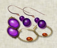
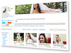
Designing your own store banner can be one way to keep the cost to a minimum when starting your new store. Because this banner will give a "first impression", you want it to reflect the products in your store. One way to do this is to incorporate a photo of your products as the second major element in the banner's design. Of course, the first major element in the design will be your business name. Let's consider a banner for an artist who sells jewelry.

Placing the product photo can be easily done by resizing and cropping the product photo and pasting it into the banner. However, not just any photo will do. The first thing we need to do is give some though to the product photo we will use. Photos that work best for this type of design have a solid colored or simple background. Not only will this type of background be a good choice for displaying your products, but it will also easily blend into the banner design.
The second step is to decide the font for your company name. There are numerous fonts available on the web. If you decide to use one of these fonts, take care that you do not violate any copyrights. Another option is to use the fonts that come packaged with your graphic software such as Photoshop. You will want your font to reflect the style of your store and its products. For a formal style, you might consider Charlemagne Std or Bickham Script Pro. For a more casual look, try Comic Sans MS or Giddyup Std.
Now that we have made our major design decisions, we are ready to create the banner.
- Category:
- Selling Online
- Tags:
- your iCraft store
- banner
- digital art
- DIY banner
- design
1 Comments
May 27, 2010 | Posted by:


