Pantone is a company that has created a language of colour that is universally understood. With this system, a colour like Red, that makes me think of an apple and makes you think of a tomato, becomes the exact, same Red! Can you imagine choosing the paint for your living room by just asking for Green?
Pantone’s founder, Lawrence Herbert, in 1963, “created an innovative system of identifying, matching and communicating colors to solve the problems associated with producing accurate color matches in the graphic arts community. His insight that the spectrum is seen and interpreted differently by each individual led to the innovation of the PANTONE MATCHING SYSTEM®, a book of standardized color in fan format.”
Every January I wait eagerly to find out what the Colour of the Year is! Did you know that last year it was Mimosa? This is the colour of orange juice, diluted by pale, golden champagne, and was THE hot colour of 2009. You may remember seeing Michelle Obama wearing it.
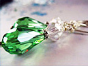
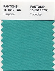 This year though, the colour is Turquoise 15-5519! A favourite colour of mine, I am pleased to say! The colour of ocean waters, of serenity, not quite green and not quite blue, with the best of both!
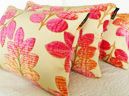
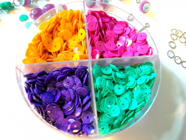
So, should you start to make everything in turquoise? If you want to, you can! A better idea, though, is to see what turquoise has to offer you. Perhaps you could add it as a complement to an old stand by, freshening the style and reinventing the entire look. Consider semi-precious turquoise as a new addition in your jewellery making. Add it to your chocolate brown pillows for a show-stopping look!
As an artist, you owe it to yourself to check out the Pantone site! It is a fantastic resource for designers, artists and crafters. There is an entire colour education to be had there and I guarantee that you will also find much inspiration for your work! You will be able to set up your own colour profile at myPantone, create your own colour palette, share, post and communicate with other colour enthusiasts! Lots of fun!
- Category:
- Trend Spotting
- Tags:
- pantone
- color psychology
- paint chips
- colour
- colour of the year
5 Comments
Jan 14, 2010 | Posted by:
Jan 13, 2010 | LisaGold
How do they exactly choose the color each year? One of the requirements I see is that it's "one of 3,000 colors available in Pantone's line of superior-quality, eco-friendly paints". That's great, but why do I have to wear it now?
I don't know for sure what colour of the year was last year, but I am pretty sure it was purple, because you couldn't buy anything, other than purple outfits last year. That's not my favourite colour and that's why it really annoyed me last year. Glad that purple is gone now.... though it still kills me that one person or a small group of people somehow arbitrarily choose the color and set the trend that everybody has to follow.... Hmmm...
Jan 9, 2010 | Posted by: weezi
Jan 7, 2010 | Fairy Cardmaker
I like turquoise though! YIPEE! The scrapbooking industry has been big on teal and lime green for a while (after the pink and brown faded). We`ll see what turquoise can bring!